December 6, 2010

Lifelist: Refinish a Piece of Furniture

I'm really excited for todays post, because it's actually been 3 years in the making. A couple of years ago, while visiting our local flea market, I happened upon a pair of Midcentury teak armchairs. I had always wanted a pair of Danish chairs, so I was really excited when I actually found some. The availability of midcentury furniture around these parts is pretty slim, so I made a rash decision to take them home with me.


They were in fairly good condition, but the cushions were a bit flat and the fabric wasn't quite what I was going for. Still, they would do for awhile. Then my dog, who was a puppy at the time, decided that wood chairs were great for her to teethe on. That's when I decided that I would have to refinish them too. I saw a picture in House and Home magazine, where one of the featured homes had a pair of dark stained Danish armchairs, and decided that's what I eventually wanted to do.


I put off redoing the chairs for a couple reasons. 1. living in a condo, we just didn't have the space to refinish furniture in, and 2. I knew that a move was in the future, and wanted to redo them to suit the scheme of the new house. So one weekend in November, under the threat of imminent snowfall I decided to head out to the backyard and get this project underway.


Here's where my dog chewed the arms of the chairs. You don't know how much this bothered my and my husband, to live with damaged furniture like this. We're a little OCD about stuff like this.


My first thought was to use a chemical stripper to get rid of the existing finish. So I went to Home Depot and picked up an extra strength chemical stripper. I glopped it onto the wood and waited to see what happened. After about half an hour, we go these bubbles appearing on the arms, which signalled progress to me. However, the bubbles didn't seem to be occuring elsewhere, and the stripper seemed to be drying out, so I applied another layer to keep the chemical reaction going.


After about an hour, my curiosity got the better of me, and I took a putty knife to the chair to scrape away at the finish. It sure looked like progress to me!


So I started to scrape. The arms were beautiful, and the old finish came off really cleanly. However the rest of the body of the chair didn't have the same success. The finish came off on some areas and not others.


You can see the results here. The finish seemed to come off easier on areas where the chairs would have been touched more often, so the arms, parts of the legs and back spindles. But the rest of the finish remained, and it quickly became clear that I would have to resort to Plan B: Sanding.


The next weekend, I grabbed my Black and Decker Mouse sander, and some coarse sanding pads, and went to work. It took about 2 hours per chair to sand them back to this condition. But it was easy, and the chairs looked fabulous. That mouse sander is awesome, and for regular sanding jobs around the home I totally recommend it. Then it really did start to snow, and everything had to come inside.


I purchased a liter of stain from an industrial coating company, Bellare Industrial Coatings, which was recommended to me. They were fantastic, and I recommend getting stain there for a couple of reasons. One is that all their stain is custom mixed to order, and they have a huge selection of colours, so you can get exactly what you are looking for. Two is that as a professional finish, it's easier to use. I wasn't willing to take a risk with an off the shelf brand from the hardware store. I don't have any photo's of the actual finishing process, because most of it took place at night. But I applied the stain and wiped it off after a couple of minutes. It was a lot easier than I expected to get an even application of colour. The two chairs were stained in one night. Following that I applied two coats of a satin urethane. Also not too difficult, just a bit more time consuming to get a nice even application with no bubbles. And now the big reveal!


Ta da! I could not be happier with the outcome. They look so fabulous, and I'm so proud to say I did all the work myself.


The cushions were redone by my mom. The cushions are actually a spring assembly which makes them extra comfy. The springs were in great condition, but the foam surrounding them was pretty decrepit. We applied 1/2" and 1" thick foam as required, wrapped the whole thing in polyester batting and then stuffed them into the new covers.


I used this great textural woven from Thom Filicia's line for Kravet. I loved how the texture was a bit of a callback to upholstery used in the sixties. But this fabric has a really nice sheen to it, which gives it a bit more luxury.


Now I just have to figure out how to keep the dog off the furniture.

November 17, 2010

Painting has been a frustrating process to say the least, and has taken us much longer than we anticipated. The previous owners did a fairly good job with their renovation, but the one thing that really fell short was the trim work. There were lots of gaps and uneven joints, so we have spent a lot of time filling and sanding everything to make it look really smooth and clean.

All the ceilings and trim have been given a bright fresh coat of white paint. We used Benjamin Moore Ultra White CC-10. It's the brightest white in their palette, and it's amazing how much fresher everything feels now. The old ochre ceilings were so oppressive. The white has really lifted the space. Also, painting the top moulding to match the rest of the trim has given the rooms an extra touch of polish.


The living room has been painted in the ever popular Chelsea Gray HC-168, also by Benjamin Moore. I love colours like this that transform in the daylight.


Even the ugly fireplace looks better. Or not.


Then we come to the office. I was completely wooed by all the black painted rooms that have been touring the web recently. I couldn't resist having a black room of my own.


This is a very unstyled shot, but totally realistic with how we are living these days with minimal furniture. The step stool does the job, but it sure hurts your bum after awhile. Anyway, the black is stunning! Everyone who come into the room is shocked by how bright it still is. And nobody really believes it's black. But it is, Black 2132-10 by Benjamin Moore.


Oh, there's a door we haven't gotten around to painting yet... bother.

So that's where we are at today. Hopefully after the weekend there will be more to show and tell!

November 14, 2010

We've been in the house for about 6 weeks now, and are starting to make some progress. As much as I love before and afters, I really wanted to show the progress of everything with my blog, even if it means revealing my unfinished business. But in order to show you progress, I have to show you all the before shots. So without further ado...


This is the entry vestibule, and you open the front door onto this elevation. The main floor has 9' high ceilings throughout the main floor, and it makes a huge difference here. Despite having a small footprint, the entry still feels grand.


Here's a shot of the front door. We would love to be able to refinish and restore it, but I think it is well passed it's prime. The veneer is peeling off at the bottom, and the exterior side is in pretty bad shape. We need all new hardware anyway, and it just makes sense to replace the whole thing. However, I have to wait for the new door, before I can wallpaper the vestibule. This makes me sad.


To the left of the vestibule is the office. It's the brightest room in the house, as it has two big windows. It also has this fireplace. The grate is the original honeycomb gas burning unit, which is apparently illegal. So we need to shut it off ASAP. I think it's a hazard anyway. But the unit is cool, and I'd like to keep that.


I think the light fixture is also original, but the glass is broken. Either way, it was going to be replaced anyway.


Here's the focal point of our living room. What a beauty. Retch. I can't get rid of this fast enough. This fireplace would have originally been the same as the office, which means the only option for a gas insert would be a 22" x 26" model. That doesn't float my boat. So we are looking into alternates.


The living room has a sliding panel, to hide an entertainment unit. While we likely won't have a TV here, it's cool that we can shut off the rest of the electronics.


Despite the large window, the living room is actually fairly dark. It has no existing light fixtures, so I'm hoping to have some potlights installed.


This is the kick ass dining room. It's huge, by my standards anyway. And you can see the little kitchen beyond.


The existing light fixture is hung ridiculously low, so that will be changed out shortly. You can also see the little niche in the corner. I'm not a big fan, but I'll live with it.


I want really dramatic curtains here in the dining room. I'm most excited about pulling this room together.


The bedroom is fairly straightforward. It has one smaller window, and a tiny closet. I wanted to drywall that up, but was talked out of it. We will just hang a curtain there instead.


So there it is. For now. This week I'll start showing some of the progress of each of the rooms. Christmas is looming and is really kicking me into high gear.

November 11, 2010

I've been wanting to share this second Vavcouver shop since my last post, but got thoroughly delayed due to a week without the internet at home, followed by a killer stomach bug this past Monday. Oh well, better late than never, and this is too good a place not to share with everyone.

My last day in Vancouver, Jacqueline and I arose early for a stop at The Cross, and then made our way over to an antique shop, called A Bakers Dozen.


A Bakers Dozen is one of those shops you could spend hours in. The shop is filled to the brim with a really incredible collection of great finds. We gasped as we walked in and saw just what we had found.


I'm not a big antiques store shopper, as so many have turned me off with their odd collections of junk, and the messy way that things can tend to accumulate. But this place was just the opposite. Everything had been organized and arranged in cabinets of collections, like the trophy case above. And there was no junk. Nothing was damaged, or in disrepair. Anything that was in the store was carefully selected to be there.


The shop was divided into two main rooms that housed the majority of the collection, but there was a dedicated ephemera room, for old papergoods, and a huge antique toy room that was fabulous.


But the best part was a special locked room at the back. They wouldn't let us take photos inside due to the proprietary nature of the objects, but the picture above gives you a small sampling. With some of the odd objects, broken things, etc the shop would put together these amazing arrangements. Some were taxidermy that they accessorized to further animate the animal, but others were 3-D collages or sculptures of found objects. They were so extraordinary. They had a collection of frames that each had a whimsical doll display. There was a strange little sculpture with a pair of old dentures. I remember an odd standing cat, and some little birds too. My description just cannot justify how incredible that room was. You must check it out if you can.

Next time you are in Vancouver, please head over to:
A Bakers Dozen Antiques
3520 Main Street
Vancouver, BC V5V 3N3

October 29, 2010

We managed to squeeze in a little bit of shopping time in Vancouver. Originally, we were just planning to hit up the usual suspects, but Jacqueline thought it might be fun to find some salvage and antique shops. Our first stop was Antique Market on Franklin Street.


What an incredible find. The warehouse looks quite unassuming from the outside, and you squeeze through a boldy coloured antique door to get in. But once inside there are thousands of incredible pieces to be found.


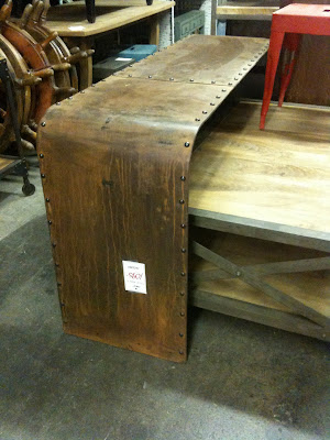
There were lots of asian furniture pieces, various antique pieces, and a great collection of industrial furniture. I have seen pieces like above for sale at specialty shops in Calgary for thousands of dollars. These were a fraction of the price.


Some shots from inside the architectural salvage area. Jacqueline insisted I find a place to use these pig heads.


The lighting selection was fantastic. Even more important is that many of these were reproductions, meaning they all had current certifications, and would be easy for designers to have installed.

If you are in Vancouver it is definitely worth checking out!

Antique Market
1324 Franklin Street
Vancouver

(please excuse the blurry cell phone shots, it's all I had at that point)

October 27, 2010

Our first day in Vancouver was spent on a Designer Day tour, that was organized by the lovely Sharon and Yvonne of Layers and Layers. While all the places we stopped at were fabulous, here are my three faves:


I have long been a fan of 18 Karat accessories, but it was really great to get to see their flagship store on Granville St. in Vancouver. This two level shop features the extensive 18 Karat range of accessories on the main floor, with their furniture collection showcased on the lower level. My top three picks at the store were:


These incredible 100% alpaca throws. Incredibly soft and finely woven, these throws will keep you cozy during the coldest winter days.


I think that the planters offered by 18 Karat are one of their strongest product lines, but these Cava vases were my favourite. Made of resin, these planters are lightweight, and make a great statement with the organic folded exterior.


The Oscuro line of cookware had many of us swooning. These lightweight clay pots are traditional cookware from Columbia. Despite their outward appearance, they are incredibly durable, and were very reasonably priced.


While we do have a Peridot store in Calgary, we all agreed that the Peridot location in Vancouver was much stronger. Peridot showcases a wonderful collection of unique furniture, accessories and lighting. The store also featured stunning paintings by Vancouver artist Patricia Larsen. Next time you stop in, check out the following:


This Sabine Desk Lamp is perfect in it's simplicity. I love the clean lines of the brass stand, with the organic drop of glass to create the shade. Divine.


No living room is complete without one quirky piece, and this Elephant Side Table is just the ticket to create a perfectly eclectic mix. The white gloss finish keeps this piece fresh in any style space.


I am a total sucker for gold lately. This Log Cocktail Table is formed out of resin, and would add a wonderful touch of sparkle to any seating area.


A fairly recent addition to the Vancouver design scene, this lovely shop features many beautiful kitchen wares and accessories for the home, and are the exclusive stockist for many of their lines. I really appreciate that point, as their products will be truly unique to them, and not found at other retailers. I hate buying things on vacation, only to discover them for sale back at home a few weeks later.
Here are my picks:


These Original BTC lights are quite stunning in person. Unlike so many similar fixtures you find today, these lights are impeccably detailed and beautifully finished.


The Fog Linen collection from Japan is stunning in it's simplicity. High quality linen napkins, table cloths, and aprons are the central pieces of the collection, which also included wood and resin table wares, and some clothing pieces.


This fabric from Cecil Beaton immediately caught my eye ;) How gorgeous is that?