Showing posts with label my house. Show all posts

February 9, 2012

This weekend I got up to some seriously delayed projects.


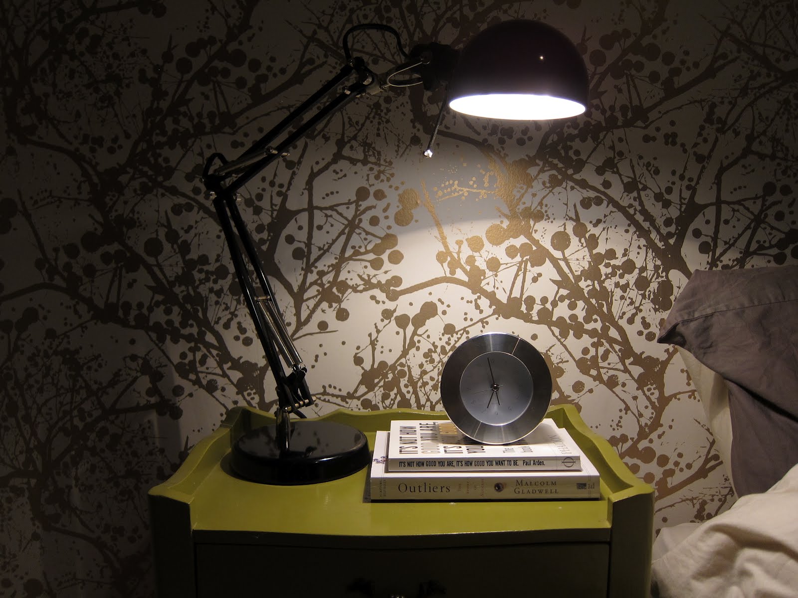
See that!?! I put up the wallpaper in the bedroom. Finally. After debating for weeks over which room I should finally have it in. And we love it!

The wallpaper is Wilderness by Ferm Living. It was my first time wallpapering, and it went pretty well. The video below was a fantastic guide, and had many tips that I wouldn't have considered, including marking the pattern match before pasting the strips up on the wall. I did the job by myself, which was also managable. Hanging the strips is pretty much a one person job, but at some points a third hand would have been handy.

I learned one good lesson, and that is about measuring the width of your wall. Like the video, I just started the paper in one corner and went across from there, but as I got closer to the other side, I thought I was going to end up with a silly 2" filler strip at one end. Indeed that was not the case, but I only had about 1/2" to spare on the width of my last strip. So try to plan the drop layout ahead of time, even if it means starting in the centre of your wall and working outwards.


Hopefully I will have more bedroom progress sooner than later. Alas, at this point, in addition to having out bed, the room is also a storage ground for our sectional while the basement gets renovated.

January 17, 2012

Well, this is certainly going to be one hell of a before and after.

I wanted to share some shots depicting the current state of our basement. After months of agonizing over what to do, we are finally starting to proceed with the repairs. The basement specialists have been in and left us with a fancy new drainage system. Since our foundation is so old (it seriously looks like packed sand and gravel in places) and will probably allow moisture in forever, this was the best route to go in our opinion. And now we get to start putting it back together.


Here's a shot of the guest bedroom, where the bed is to be situated. The repair work will allow us to fix some of the strange and poorly installed casing details that have bothered me from the beginning.


Here's the lovely south facing bedroom window, which allows ample amounts of nothing into the space. Also note, there is no lighting installed anywhere in the two rooms down here.


Here's the pinky brown media room.


And another shot looking toward the actual media wall. ooooh, ahhhhh. Beyond that is the laundry and crawl space.


And this is the vignette at the bottom of the stairs.

Can get any worse than that right? I'll keep you updated over the next couple of weeks with our progress!

January 12, 2012

Back in November, I wrote about a little quickie makeover I was planning for my entryway. Well, we've now been living with it for about a month, and it is fabulous! So, here's what we did to get our wallpapered effect.


For those of you who don't recall, here's the mustardy before. Our entry is only 4' by 6', so it's really hard to get full shots of the space. The first step was to paint the wall. We have chosen a soft white to use in the house, Classic Gray, OC-23, by Benjamin Moore. We have been using the Aura paint in the matte finish. It is fantastic.


Next is to choose your instrument of choice. These are Sharpie poster paint markers! They come in three thicknesses, and I bought two of each of the larger ones, and one of the smallest, since I didn't know how much coverage I would get from each. They come in oil and water based, so make sure you get the water based. It will dry faster which is important for minimizing any smudges. I just picked them up at Michael's for about $6 a piece.


The other thing you will need is a straight edge of some sort. Using a metal ruler with a cork back is the best. It is easy to hold in place with one hand, since the cork gives you some grip. And since the markers are quite liquid when they go down, you want the cork thickness to raise the ruler off the wall and prevent and bleeding.


And then you start drawing. I had loosely planned out my design before, but it was quite spontaneous when I was actually working on the wall. Start at one edge and work outwards from the corners. You will have to do your longer lines in stages, so you should feather out the ends as shown in the photo above, which helps to camouflage where you had to reconnect the line. After a couple of lines, you will get the hang of lining up the lines perfectly with the various thicknesses of markers.

When drawing the lines, I kept a rag on had to wipe the edge of the ruler each time. I removed the ruler by putting pressure on the lower edge, which lifted it away from the wall, and was easier to grab. Be careful not to touch or smudge the lines, as they won't dry immediately. Wipe the edge of the ruler each time to make sure your hands are clean before touching the wall again. If you do smudge, its easy to touch up the lines with a bit of your base wall colour when you are all finished.


And here's how it turned out! I did lines of two different thicknesses at random angles all over the wall. I stopped myself short, since I was sure I could have kept going and would have over did it. All in, the linework took about 1.5 hours of work. Painting the wall was another 2-3 hours.


Here it is all set up again. The room isn't accessorized as I eventually want it (that mirror is far too tiny!), but it looks pretty damn good for now.

August 29, 2011


Guess what I won!?!


Thanks to Alanna Cavanagh for the print and to Emma Reddington of the Marion House Book for hosting the giveaway. Our kitchen will be next on the list for a paint job, so I can't wait to get this framed and hung in there!

I think I'll do a bigger post on Alanna this week, for those of you unfamiliar with her work.

happy, happy!

August 23, 2011


Despite the damaged basement, I'm still planning the finishing touches for the rest of the house. So I brought home some lovely Quadrille fabric swatches as options for the bedroom, to accompany these drapes.

June 13, 2011

Off of our kitchen we have a small pantry area. It features a big window, and is actually quite a nice little room. The last owners really weren't using it to it's full advantage though. It was being used as a pseudo pantry/closet, as this house doesn't really have coat closets at the entrances.


Here's the before shot. It featured the same mustardy yellow paint that the rest of the house had, and a shoddy metal shelving system. There were also those black shoe storage boxes mounted to one wall. While the room is adjacent to the back door, we didn't really feel it necessary to have coat and shoe storage here. We were also lacking storage for small appliances and the like, and decided to turn the room into a proper butlers pantry.


Ta da! Here's the after! We are so super happy with the transformation. It feels so much bigger now. We first painted over the mustard with Classic Grey (OC-23) from Benjamin Moore, which is a slightly antique white colour.


We didn't have a big budget for this space, as it was just the kitchen pantry, so most of the items you see are from Ikea. The shelving unit is the Varde, which has a nice butcher block top, and stainless steel shelves below, which is great for cleaning. The floating shelf is the Ekby system, and the little stool is the Bekvam. The aqua sisal rug is from Steeling Home.


I picked up these galvanized letters when I was at Orling and Wu in Vancouver. I also purchased the wire basket there as well.


The wall hooks are from Anthropologie.


I purchased this old window from an Antique shop awhile back. After a good clean, I painted the glass panels with blackboard paint, and added some eye hooks along the bottom for hanging keys, etc.


Glass storage jars from Crate and Barrel. I love their kitchen section, which is full of classic pieces at reasonable prices.


This mint plant is the only house plant that I have managed not to kill. It grows like a weed, and needs very little attention. It adds some nice greenery to the room.

I think the room needs a little bit more art, and I would love to replace the light fixture with an antique schoolhouse style fixture. Other than that, this little makeover is making me even more eager to tackle the rest of the kitchen changes.

May 30, 2011

I had a super productive weekend, and I'm happy to have gotten lots of little things taken care of around the house this weekend. It's great to have this stuff off my plate, so I can better enjoy all the lovely weather we've been having. Here's a few sneak peeks of what I got up to.


While running errands in Kensington, I stopped into Cushy Life to see if they had the latest Dwell Bedding so I could check the colours against my drapery fabric. They had these great little oil paintings by Calgary artist Frances Marina Vettergreen, and I couldn't resist.


I don't think I mentioned that we bought a vintage poster from a dealer in Maui while we were there. Well, I finally got it back from the framer, and proceeded to hang it in the living room immediately.


I hung the curtains in the bedroom! They look fabulous.


I've had my lovely design prints sitting on the mantel forever, and finally got around to hanging them while I was hanging everything else.


I hosted tea for my mother in law and some friends on Sunday, so I made a quick batch of scones. I'm generally weary of online baking recipes, particularly scones, as I am very picky. But these were perfect.


I got up to a little bit of gardening, and cleaned up the front porch. Margot dug a big hole too.


Most of all, I have enjoyed just sitting in the living room, seeing everything finally coming together. And feeling very satisfied and very much at home.

May 16, 2011


I bought some curtains.


These lovelies are the Scattered Chevron Curtains from Anthropologie, and they are going into our bedroom. It is very unusual for me to be drawn to something like this, but I wanted something completely different than my natural tendencies. I really wanted to use coral tones somewhere, and I think this is perfect. Now i'm thinking about wallpaper, grey linen upholstery, and the new bedding.

April 17, 2011


This week I headed down to Lightform to checkout their big showroom sale. The store will be relocating in a couple of weeks, and they are taking the opportunity to refresh all their showroom lighting. I thought I'd pop by to see what they had in store. And this is what I saw when I first stepped inside.

It is the Josephine pendant by Metalarte.

When I talk about delightful design, this is it for me. I just love that curvy shape. So this will go in either the office or the bedroom, depending on where it works best. I can't wait to show you when it's installed!

February 26, 2011

Our new sectional sofa for the media room is due to arrive in a couple of weeks, so that room has now been pushed to the top of my list. This room is in the basement, and has no light, which is why I have never shared pictures of it. There is one tiny window, and that's about it.


I do have a pretty clear vision of what I want down there. The basic colour scheme is Chocolate, Cream and Magenta! We have a nice chocolate brown wool carpet down there, and I'm going to use my favourite brown to paint the walls and ceiling as well. Because it's a media room, my hubby want's it dark, so that's what he going to get. Searching for a sectional caused us a lot of grief. We have a 3' wide stairwell to get it down, and then a tight corner to turn, with a really low ceiling. It was very difficult to find one that would fit. In the end we found the Domino Sectional would fit just right, and ordered it in cream. We also ordered a unit from BDI, which are my favorite for media storage as they look great but have tons of features to support your equipment.


We still need to get a coffee table and some accent pieces, but those will come in time. Right now I'm focusing on the art that I'm planning to put in there. One wall is going to be a photo gallery for personal photo's. I'm not big on having lots of photo's of us around the house, but it's nice to have those memento's somewhere. I though the media room would be a good place, as it's also a more personal space. On the other wall I want to have art that reflect's the entertainment part of the room, and I have been searching for art that is inspired by our favorite movies and musicians.


Some great websites to check out for posters like these are:


February 19, 2011

Photo of Me, Circa 1985

I have a bunch of little projects I want to get to this weekend and writing them down is the best inspiration. So...

1. Finish painting office closet.
2. Buy shelving for office closet and pantry.
3. Install shelving for office closet and pantry.
4. Buy filing cabinet for office.
5. Sort out coat hanging solution for office closet.
6. Buy hooks for pantry.
7. Source area rug for pantry.
8. Put all the office stuff into the office closet.
9. Take Margot to get her nails clipped.
10. Buy dogfood.
11. Buy bulletin board supplies.
12. Make bulletin board and hang.
13. Sort out what items I need for trip to Hawaii!
14. Buy items I need for trip to Hawaii!
15. Do not dispair when I can't find sunglasses that I like.

Between the party I'm headed to tonight, and some recreation time that I also want to put in this weekend, I think this is very doable. What are you planning for your long weekend?

February 18, 2011

One trend in design these days is a return to the basic & utilitarian. I really appreciate this movement, that focuses on tried and true standards of the past. And I think that kitchens in particular are a great space to incorporate these ideas and details.


When we moved into this house, I was a little disappointed that the kitchen had already been renovated. But I decided to live with it, despite not being what I would pick for myself. It features dark brown flat panel cabinets with stainless steel hardware, black polished granite countertops, and a great series of appliances from Fisher Paykel. Oh, and the dirty yellow walls that I am such a fan of. I love the appliances. Everything else, not so much. Here are a couple of photo's for reference.


The renovation was done well, but frankly, it's really boring. Everything is just square and flat. I'm a very textural person, and the lack of detail here drives me crazy. It needs some personality. I feel like I've seen this kitchen a thousand times in condo magazines, and I hate that. So here's what I'm planning to do, based on the fact that I also don't want to spend any money on this either.

1. Paint the room a nice bright white. You can see the pantry beyond that we painted last weekend. What a huge difference. This will immediately open the space up.

2. New lighting. The lighting now is terrible. Two of the undercabinet fixtures don't even work. I often say that lighting is the most important tool in the designers box, so to get this right, I am willing to make the investment. We will need new undercabinet fixtures, and I'm planning to add 6 potlights over the perimeter worksurfaces. Then I'd like to rip out the three existing pots, and replace them with a couple of pendants, to light the island.


3. New hardware. Those flat pulls drive me crazy. You can't hook your finger under them to open the cabinets. More often I just grab at the bottom of the door to open. I am cursed when it comes to replacing door pulls, as they never seem to have a standard screw placement. So my trick is to specify longer cup pulls that cover the existing holes.


4. New backsplash. I feel that of all the finishes existing in the kitchen, this is the easiest to change. A simple subway tile backsplash will help to create some needed pattern in the space, particularly if we use a contrasting grout.


I would also love to get the counters honed, as the polished black shows everything. But that's a maybe item, depending on the cost. Other than that, adding a few great accessories should help to bring everything together.

Vintage Clock