Showing posts with label architecture. Show all posts

September 1, 2010

I've been feeling less and less inspired by many of the homes I find on the web these days. So many interiors that I am coming across seem to feature the same sort of ideas over and over again, and not much is looking unique anymore. I have seen so many cluttered, collection filled, flea market sourced, filled to the brim with tchotchkes homes that I can't stand it anymore. Plus: white walls, yep, painted floors, yep. I get it.

(And here is where you can call me a complete hypocrite, because chances are I will paint walls white, and try painted floors too. So bookmark this post. I promise.)

It was such a refreshing change to see this beautiful interior from Tamizo Architects Group in Poland. I love the restrained palette of white and black, with the pale natural wood tones. I love how graphic the space is, but remains soft with the sheer curtains. For me, this is a perfect play of contrasts.


The design also perfectly balances the weight of each element. I love the tension of the large black light shades over the dining table.


Those stairs are simply sublime.


I also think that it is a great showcase of how black can be used in an interior and not swallow the space in its darkness.

To see more pictures, or learn more about Tamizo Architects Group, see here.

via Notcot. Photo's all by Tamizo Architects Group.

August 1, 2010

These two tiny house have me thinking a lot about what space we really need for living. Both are roughly the same tiny square footage, but both have dealt with the interior in vastly different ways.

This beautiful little Victorian retreat in the Catskills is a great example of what you can do with a space so tiny, and yet fill it with personality.


Sandra Foster took an old 9' x 14' hunting cabin and hunted throughout upstate NY to find salvaged materials to use in it transformation. Old wavy glass windows, screen doors, and handmade scroll trim were all added to the existing structure to create this sweet little Victorian sanctuary. More amazing is the fact that she did all the work herself, and it cost her a whopping total of $3000.


Crystal chandeliers, billowy white textiles, and stacks of old books and china were the final touches to add that sublime and romantic feel. I'm sure that stepping into this place is like stepping into a fairytale. You can see more at the New York Times.


Or there is the opposite approach.

This 130 square foot cabin called the Signal Shed was designed by architect Ryan Lingard to sit in the wilderness near Joseph, Oregon. It was designed as an affordable and sustainable shelter, to meet all the basic needs of an outdoor adventurer. It can be used year round, and is complete with a wood fired stove and portable toilet.


The house is built on a raised platform, so as to disturb the site as little as possible. It is built of entirely wood, with a cedar siding and shutters to close in all the windows during colder months. Total cost for the shelter itself was only $10,000. Not too bad for a fully functioning home away from home.


The interior of this cabin is very utilitarian, with wood floors and plywood finished walls. Can you see they are even eating off of slices of tree trunks as plates? It's very basic and simple. Sunset has more pictures and info here. You can even buy the plans if you want to build a shelter of your own.

So which would you choose?

June 16, 2010

One of the other highlights that drew me to Seattle was the Seattle Central Library.

Photo by Ramon Prat

Designed by OMA and LMN architects, the library opened in 2004 as a stunning addition to Seattle's downtown.

Photo by Philippe Ruault

The exterior of the library is composed of diamonds of glass within a bold steel framework, which is placed at various angles, creating a dynamic shell for the space within.


I really loved how fresh the entire space was, and how the design team really took some great risks within the space. Sometimes you visit these interesting architectural marvels, and inside the space is a little dead. Sure there are amazing windows, but what else?
Here the escalators are punctuated with this amazing saturated yellow colour, taking a typically utilitarian space and making it a focal point. FYI the elevators were this colour inside too.


The meeting room level was this amazing organic space, finished in a bright glossy red, with red lighting. Very cool.


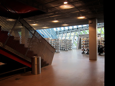
This perforated metal formed a transparent screen where you could view the main floor of the library. This material was also used on the main floor as ceiling panels that were inset into a t-bar grid, with downlights above, which helped to disguise the mechanical systems and less attractive lighting.


Although there were limited finishes used within the space, each choice was very unique and interesting from the rest. Edge grain wood floors, funky carpet patterns, perforated metal, glass, and high gloss coloured lacquer were some of the finishes that were most prominent. Typically interior palettes have some sort of cohesive element, but everything here was so very different and unusual.


I only focused on my experience with the interior of the space, but archdaily has an amazing article on this building that explores the entire design of the structure, and how the architects reimagined the organization of the library. It also has plans and sections of the structure to better understand how the whole thing is put together. They say it way better than I could, so I'm just going to direct you over there.