
Heaven's on Fire by The Radio Dept.
February 20, 2011
February 19, 2011

Photo of Me, Circa 1985
I have a bunch of little projects I want to get to this weekend and writing them down is the best inspiration. So...
1. Finish painting office closet.
2. Buy shelving for office closet and pantry.
3. Install shelving for office closet and pantry.
4. Buy filing cabinet for office.
5. Sort out coat hanging solution for office closet.
6. Buy hooks for pantry.
7. Source area rug for pantry.
8. Put all the office stuff into the office closet.
9. Take Margot to get her nails clipped.
10. Buy dogfood.
11. Buy bulletin board supplies.
12. Make bulletin board and hang.
13. Sort out what items I need for trip to Hawaii!
14. Buy items I need for trip to Hawaii!
15. Do not dispair when I can't find sunglasses that I like.
Between the party I'm headed to tonight, and some recreation time that I also want to put in this weekend, I think this is very doable. What are you planning for your long weekend?
February 18, 2011
One trend in design these days is a return to the basic & utilitarian. I really appreciate this movement, that focuses on tried and true standards of the past. And I think that kitchens in particular are a great space to incorporate these ideas and details.

When we moved into this house, I was a little disappointed that the kitchen had already been renovated. But I decided to live with it, despite not being what I would pick for myself. It features dark brown flat panel cabinets with stainless steel hardware, black polished granite countertops, and a great series of appliances from Fisher Paykel. Oh, and the dirty yellow walls that I am such a fan of. I love the appliances. Everything else, not so much. Here are a couple of photo's for reference.


The renovation was done well, but frankly, it's really boring. Everything is just square and flat. I'm a very textural person, and the lack of detail here drives me crazy. It needs some personality. I feel like I've seen this kitchen a thousand times in condo magazines, and I hate that. So here's what I'm planning to do, based on the fact that I also don't want to spend any money on this either.
1. Paint the room a nice bright white. You can see the pantry beyond that we painted last weekend. What a huge difference. This will immediately open the space up.
2. New lighting. The lighting now is terrible. Two of the undercabinet fixtures don't even work. I often say that lighting is the most important tool in the designers box, so to get this right, I am willing to make the investment. We will need new undercabinet fixtures, and I'm planning to add 6 potlights over the perimeter worksurfaces. Then I'd like to rip out the three existing pots, and replace them with a couple of pendants, to light the island.

3. New hardware. Those flat pulls drive me crazy. You can't hook your finger under them to open the cabinets. More often I just grab at the bottom of the door to open. I am cursed when it comes to replacing door pulls, as they never seem to have a standard screw placement. So my trick is to specify longer cup pulls that cover the existing holes.

4. New backsplash. I feel that of all the finishes existing in the kitchen, this is the easiest to change. A simple subway tile backsplash will help to create some needed pattern in the space, particularly if we use a contrasting grout.

I would also love to get the counters honed, as the polished black shows everything. But that's a maybe item, depending on the cost. Other than that, adding a few great accessories should help to bring everything together.

Vintage Clock


February 17, 2011
All this talk of chocolate the past couple days has reminded me of some beautiful chocolate shops that I have come across lately. I've been wanting to share these for awhile, but now seemed an appropriate time to showcase them all together. You know, while you munch your way through a heart shaped box of confections.
From the WonderWall website:
"The theme is "Chef's Table in the Kitchen." The entire establishment is rendered as a chocolate kitchen, with a table placed within to accommodate invited guests. Covering one of the walls are 56 different types of chocolate blocks, tastefully placed in glass showcases."


Le Maison des Maitres Chocolatiers
Brussels, Belgium
The concept for this space evolved from the idea of chocolate as a gem, which explains the faceted appearance of the walls and ceiling. While the dark chocolate colour of the walls, floors, and ceilings suggests a cave like environment, the facets reflect the light at various angles, which opens up the space. The fine reveals also suggest the break marks in a bar of chocolate.


From the WonderWall website:
"This is Godiva’s new concept flagship store. Godiva’s idea was “treat thyself”. Wonderwall’s intention was to add a breath of fresh air to the more traditional image Godiva instill. The shop features humorous design details such as the “melting chocolate” ceiling combined with the primarily classical interior design. The boutique’s popular and fashionable location of Harajuku has also been considered in the overall design. Passers-by can view both its entrance as well as the customers enjoying their time with chocolate on the second floor cafe."


February 14, 2011


February 13, 2011
Oh, wow. I totally went off the rails there didn't I? It always happens when I take a trip, work comes back with a vengeance. Oh well. The vengeance is done, and I can get back to my regular schedule.
This weekend we are tackling some of our storage issues. We have an unfinished closet in the office that needs some shelving and will house all the office supplies and the printer. We are going to reuse the existing adjustable rack shelving that is currently in the pantry, because it's ugly and useless in it's current state. So we have ripped the pantry apart, and are redoing that as well. The idea is to make it into a butlers pantry of sorts, with lots of open shelving for storage. Stay tuned...
Another quandary that I am pondering is our delightful fireplace in the office. Here is how it exists today.

It's the only thing that has been left of the original house. The only thing I dislike about it is the horrible colour. And I'd hate to rip out something that reflects the original integrity of the house. So I've decided that a lick of paint to hide the orange is all it needs. Now I just need to decide what colour to paint it.
Here are a couple of images that are tugging me in all directions:

White is my first consideration, but is it a bit safe? This image is a good idea of what a simple white fireplace will look like, against the black walls.


Pow, Whop, Bam! Look at those colours! My mind is reeling. It big risk but big impact.
Care to weight in?
February 2, 2011
The most exciting thing for me when I visit design shows is always the more conceptual exhibits, and IDS11 didn't disappoint. This year the installations were entitled Sibling Revelry, which featured designer siblings creating spaces together.
The first space was called the Green Bunker by My and Thien Ta Trung, who operate the design studio, Periphere, and their shop, Domison, in Montreal.

My and Thien created the most conceptual space in the exhibit featuring free form upholstered stool, sculptural plants stands, and a textural paper installation.


The second space was designed by David and Glenn Dixon, from Dixonhouse in Toronto.

The inspiration for this space was the story of the 1000 paper cranes. The ceiling was finished with lattice work, from which the 1000 paper cranes were suspended. The quality of light within the space was really beautiful, and it was hard to believe you were in the middle of an exhibition hall.


The third space was designed by the Brothers Dressler, who operate a woodworking studio in Toronto.

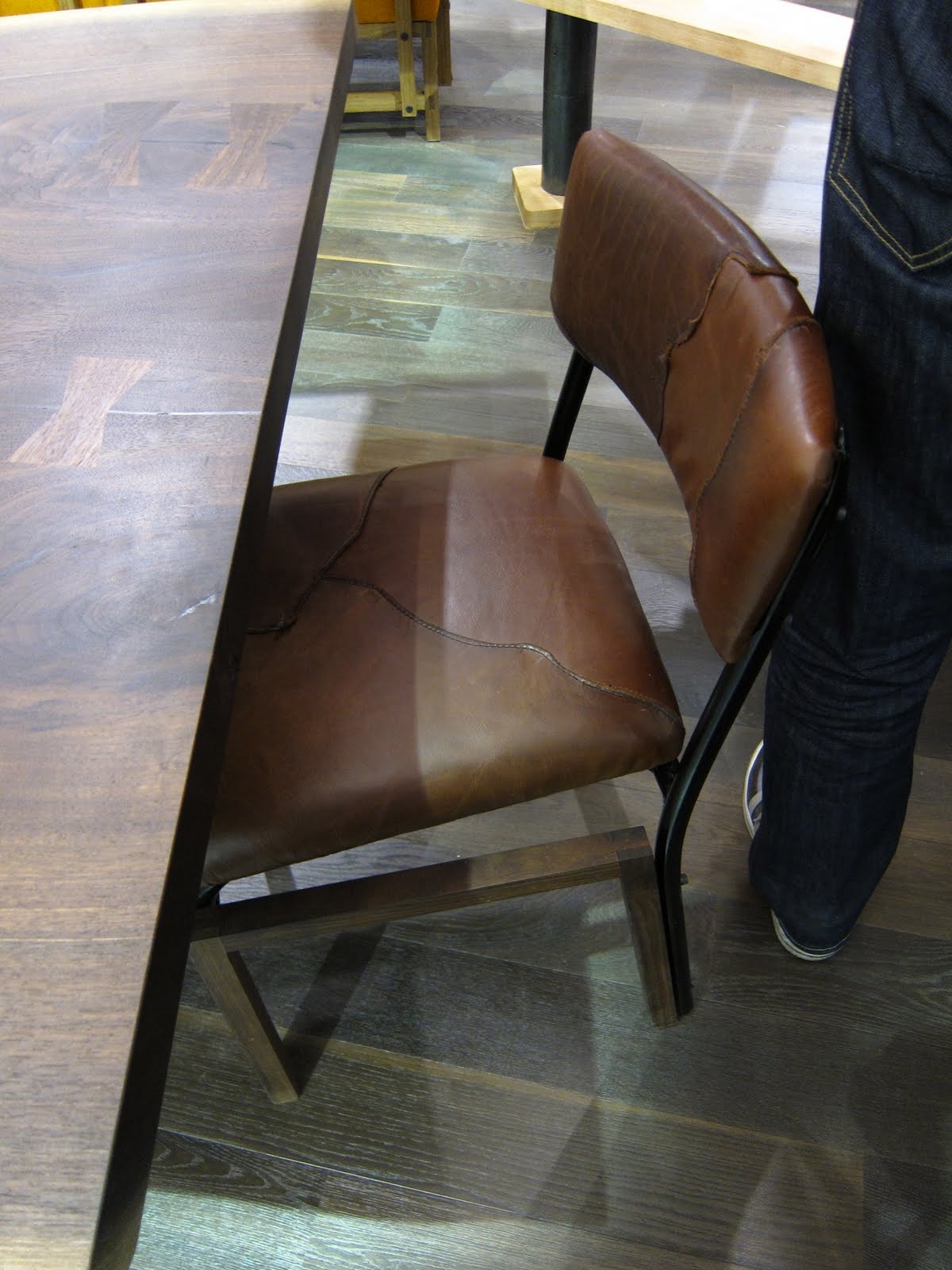
The space perfectly reflected their vision of repurposing and up-cycling materials by combining all sorts of salvaged wood pieces in unique ways. Some forms were more raw salvage, like the exterior wall made up of the old windows. Others were very refined, like the furniture pieces you see below.


The last space was designed by Sarah and Theo Richardson, of Sarah Richardson Design, and Rich Brilliant Willing respectively.

Obviously this space was most popular, as both siblings are super stars in the design world. This space appealed to me, because it was the only one where the siblings came from very different design aesthetics. I loved seeing the contemporary lighting and furniture from Rich Brilliant Willing's line, juxtaposed with Sarah's classic eclectic style.


So which was my favourite? I'm gonna say the Richardson Siblings was the space I most responded to. I loved that they created three small spaces, I loved the pops of colour, and the eclectic mix of pieces that were used in the space. Maybe it's the obvious choice, but it certainly hit all the check marks for me. Yes, it wasn't as conceptual as some of the others, but maybe I'm not as deep a thinker as I claim to be. Besides, I think it's always best to follow your gut, and I just felt happy here.
Subscribe to:
Posts (Atom)


