February 28, 2010

Life List: #72 Go Dogsledding


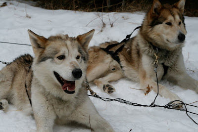
This weekend, I got to knock an item off of my life list! Some friends and I headed out to lovely Canmore to spend some time in sleds with dogs.


Our tour was booked with Snowy Owl Sled Dog Tours. It seems they come highly recommended by Dean McDermott:


About 30 people were booked for each tour, and we were all driven out to Spray Lakes, where the teams were waiting for us. We got to mingle with the dogs, and were given a 30 instructional chat, where we learned how to go, HIKE!, and more importantly, how to stop, WOAH. There they also told us that we would each have the opportunity to drive the sleds on our own. I didn't know what to expect, but I didn't really think it would involve a lot of independent driving.


We were all split into teams and assigned sleds, where we were introduced to our dogs. I decided to drive first, while my partner climbed into the sled. And then we were off!


It was a bit intimidating when we were told we were going to be driving the sleds ourselves, but the sleds were deployed with a guide on every third sled, and they were there to instruct us through the entire process. They controlled the overall pace of the tour, as well as letting us know when up and down hills, or sharp corners were coming up.


We chose an absolutely beautiful day to go out. It was 4 degrees, which made it all the more pleasurable. The mountains were absolutely spectacular, and the sky was clear and bright. Such a perfect day for outdoor pursuits.


All in all, we were out on the sleds for about an hour and a half, each of us getting to drive for half the trip. I had such a blast, and definitely didn't want my turn to end. Turns out that Snowy Owl offers overnight trips if you are really interesting in spending more time with the dogs. Maybe that's the next item to add to the list?

February 26, 2010

Designer Profile: AvroKO

Interior of European Union

Glass Detail at European Union

I first discovered AvroKO when I was doing research for one of my own interior projects. At the bookstore, I discovered their book, Best Ugly, and was instantly enamored.

Bar Detail at Omido

AvroKo is a renowned firm from NYC who strive to achieve total control over the design process. They describe themselves as a design and concept firm, so in addition to doing amazing interiors, they also do all the conceptual and branding work as well, which creates an incredibly cohesive identity for the client.

Interior of RN-74

Interior of Sapa

Their designs are largely inspired by history and culture, and capture vignettes and imagery to reflect this inspiration. Another signature of AvroKO is the incredible character and detail they bring to a space through the use of repurposed goods, vintage pieces, and other scavenged materials.

Interior of Lavo

And as far as design is concerned, they truly do have full control over their process. I find this most relevant in the lighting they use, as many of the pieces appear to be custom designed to the space. They also have amazing metal work featured in the spaces they design, whether it be a ceiling detail, freestanding screen, or furniture piece. It makes me think that they have a hand in the construction side of things too.

Light Detail at Quality Meats

Custom Metal and Glass Shelving at The Monday Room

AvroKO also has a unique way of utilizing ordinary materials in an extraordinary way. You can see below, the bathroom is actually clad in hardwood flooring, but reversed to show the routered underside of the planks. The tile installation features an exaggerated grout joint, taking the lowly subway tile to a heightened level of design.

Washroom at Sapa

Entry Detail at Quality Meats

AvroKO has been featured in many magazines and books and has received many accolades, including a James Beard Award. Their designs have set a high bar for design in NYC, arguably the most saturated design market in the world, and they continue to push the boundaries of their creativity. I have focused mainly on their restaurant interiors here, but to see more of their portfolio, as well as their branding, furniture, and clothing line (!) check out their website.

February 24, 2010


Of all the dresses I have been looking at this season, this one is by far my favourite. It is by Calvin Klein for his Spring 2010 collection. I love asymmetrical dresses, but I also love the crispness of this dress too. Here's a closeup so you can see more detail:


I would love to make a dress similar to this; I think it is perfect for summertime. Probably more a-line in the bodice, as that stitching is way to advanced for me. And I love that puffy sleeve, but I'd like to see the other shoulder dropped instead.

Or, maybe CK will make my dream come true, and offer online shopping in Canada...

February 23, 2010

Paper art is one of my favourite things and it seems that security envelopes are everywhere these days. Artist have opened these envelopes up, literally, to reveal the beautiful inner patterns, and use them in a variety of ways. Here are a few of my faves:


The above installations are by Francisca Prieto. These installations comprise her latest show in London, called Between Folds/Envelopes, where she has folded the paper using different origami methods to create the overall composition. There is nothing I love more than the sharp preciseness of the origami, combined with all the beautiful blue patterns. Photo's via Design*Sponge.


I first learned about girlprinter via the latest issue of Uppercase, which contains a spread of her collection of security envelopes. While looking at her site, I found that she recently had a show of letterpress prints featuring security envelope patterns. Very lovely. Photo by Carolyn Fraser.


And while I was checking out Carolyn's blog, I found some extra envelope eye candy. These images are of artist Kristiina Lahde's work. I love the lightness of these pieces. She has lots of great paper art on her site. It's so incredible the time and patience that must go into a piece like this. I want to hold my breath when I look at these, they are just so fragile and beautiful.


There are lots of people making buttons or accessories with security envelopes too. The image above is from Becky's Buttons etsy shop, but I've seen lots of these around. Actually easy to make yourself too, if you have a button maker.

February 22, 2010


I bought this new nailpolish. It is called Dark Room by OPI for Sephora. At first I didn't love it, but it's starting to grow on me. The bottle makes it look a bit more blue, but it is a very dark teal-green.


I think it would look good with this dress below, on Keri Russell. I don't know where this image came from, but I've had it on my computer forever. I just love that dress.

February 21, 2010


Love this. Just good musicians making beautiful music together.

February 18, 2010


I added another item to my life list today: 76. Attend Modernism Week in Palm Springs.
I have to share this link with you for the Unhappy Hipsters blog. It is so great. I love that most of the images are from Dwell magazine. I love Dwell magazine, and I love this blog for making fun of it's pretentiousness. Found via sfgirlbybay.


Without a doubt, my most loyal standby fashion website is J Crew. I just love the way they style their outfits; they always look so effortless. And I think they best represent the way I want to dress myself, so I often find myself migrating over there and saving images from their collection, just to use as inspiration in the way I put my own outfits together. See what I mean:


I also might be slightly in love with this model. I can't help it, she knows how to work those clothes. Even though she is probably about 14.

February 17, 2010


I saw this awhile ago on Loobylu. It's marvelous, albeit a bit creepy.

February 16, 2010


I'm sure everyone has seen this, but it seems that Liberty of London is the latest brand to partner with Target. The line is expected to hit stores on March 14th. I was lucky enough to purchase some Liberty fabric earlier this year, and it is just so lovely. The hand of the fabric is so smooth, and I just love their patterns. So i hope this can translate to their Target line. And here's an extra link to whet your appetite, via making it lovely.

Again, my love for Scandinavian design is pushed another inch, by the launch of these AJ lamps in 5 new colours. I love the line of the shades, and these would be a fantastic investment, being steel these would last forever. And you could never fall out of love with one of these beauties. Make mine light blue please! Note: anyone know anything about converting a european lamp to work in North America? That is the only thing stopping me from pushing that purchase button right now. Found via Grey.

And to go with my earlier post of my love of classic British fashion, I just came across this site, via Wikstenmade. Oh yummy.

February 10, 2010


Smythe just launched their Spring 2010 collection and is again, full of gorgeous jackets that I would love to wear. Luckily, or not, these are now sold at our local Holt Renfrew store, whereas before they were just tempting from afar. The gold jacket above is my favorite so far, but I wouldn't say no to any of the others, really.


February 8, 2010


My mailbox was full of exciting deliveries today! First up, was this great package from Nervous System. I first found Nervous System on Etsy a while ago, and had been coveting their stuff for awhile. All of their products are made using algorithmic tools, don't even ask me how that works, but the results are these beautiful, open weblike forms.


This bracelet is made from nylon using a 3-D printing method, where layers of nylon are slowly added to the form to build up the design. So cool! And they offer different sizes for their bracelets, which is great because this is a gift for my sister, who has very dainty hands, unlike me.


The next thing I pulled out of the mailbox was the new copy of Uppercase Magazine. Designed, edited, and published by Janine Vangool of Uppercase Gallery, the magazine is full of really inspiring creative tidbits and stories. She is also quite the local success story in my opinion, and it's so inspiring to see someone local doing something that has been embraced by so many people, and that takes up lots of webspace on my favorite blogs and twitter feeds. How cool to have people across the world reading this little magazine?


That's the first 4 issues all stacked together. Starting to look like a nice little collection aren't they?

February 6, 2010


I have piles just like this all over my house. Stacks of little notes, business cards I've picked up along the way, phone numbers or contact info jotted down. And my husband just despises them. They settle in unused corners of the desk or kitchen and just end up looking cluttered. This drives him crazy. So I decided to do something with all this stuff, to keep it more organized.
I've had this journey book from Lovely Design for awhile now, not really having a reason to put it to good use. I'm not much of a journal keeper, and I've tried a couple of times to start, but to no avail. So when I looked around for something to conglomerate my piles into, my eyes fell upon this little book, which coincidentally happened to take up residence at the bottom of one these said piles.
I sorted them into categories and taped and stapled them into the pages of the book. And simple as that, all my piles disappeared.
It's so great to have everything in one place. Now I can just reach for the book if I want the name of that store I visited in Vancouver last year, or the web address for someone I met in Toronto. And I'm happy that the book is living up to it's name and actually documenting my journeys.
One note if you are planning to do this yourself. A regular hard-bound journal is likely not the best thing because the cover is so hard. Journals are not designed to have all that extra paper and material stuffed into it. So find a journal with a softer cover. The lovely journal is great because the board used to make the cover is flexible enough to accommodate the extra fullness in the pages. It will need something to help keep it closed though, so a nice elastic or ribbon should do the trick.